 Metalico Cowl {knitting pattern}
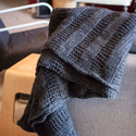 There's A Chill in DeAire {blanket knitting pattern}
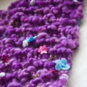 Free: Quirky Quick Knit Scarf Knitting Pattern
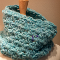 Fandago Cowl {free crochet cowl pattern}

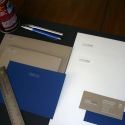


Just don't tell my husband
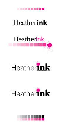
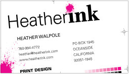
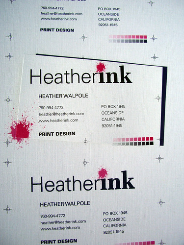
Projects come in and finished pieces go out. I love it when I land a new client or get a new project from an established client. I never thought I would enjoy freelance design work. I don't know why I thought I wouldn't like it, maybe it was a confidence issue or maybe I thought I wouldn't be able to find enough clients locally. Whatever the reason, I'm glad it didn't completely paralyze me.
I was slow to find clients in the beginning. A friend led me to my first client and that one contract lasted nearly six months, not because it was supposed to but because I was getting my feet wet and he was incredibly busy. I had one or two other contracts during that time period. Slowly more jobs started appearing, an old friend from college needed a logo for her husband's landscaping business, my uncle needed a price sheet for his photo lab and so on.
Now jobs arrive at a steady pace, so steady that I have to keep track of what's come in, what's gone out and who still needs to pay me. I am having such a good time with all of it that I want to do more. Every job is different and that makes everyday different and that keeps me motivated. So motivated that I want a MacBook so I can sit on the couch in the evening and do EVEN MORE WORK.

 Heather Walpole