Finally, after months of deciding whether to get a 'real' job or work freelance, I decided to design some business cards and give the world of freelancing a try.
Conceptually I wanted my business cards to reflect my company as a graphic design studio that focuses on print design. Whenever I begin a project I list all the things I can about a topic. So for print design, let's see, type, printing, color, ink, crop marks, color bars, printing press, ink, misprints, etc. Then I focus on combining some if not all of those things into the logo.
The colors weren't hard, black and pink. So then I started to play around with print bars and ink splots trying to see what looked best together. I tried different fonts some with serifs and some without. I even got a little crazy and did a gradient on Heather.
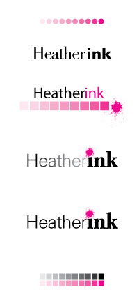
I started to see something I liked. Black type with magenta ink splatter as the dot above the "i" was really starting to grow on me.
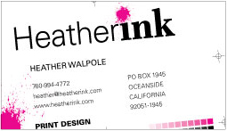
Next came business cards. Originally I thought I wanted an over-sized card, maybe 3 inches square. They passed, but I wasn't in love with them. Something was missing, they needed more excitement.
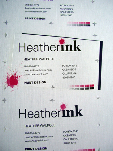
I went back and looked at my original ideas about printing and print design. What about crop marks or registration marks? What if the printer 'messed up' my cards? How would they look?
I moved it sideways, upside down, backwards. None of those ideas worked. What if the card was cut out crooked? Perfect.
I landed some registration marks, the printer bars, an ink splot for good measure and made sure they were pretty off center.
I love them, hopefully they bring in some business!