Green seems to be a color that provokes the most emotion from people. My mom has always considered green to be her favorite color. One of my sisters has painted each house she's owned green. A friend of mine bellows an operatic note, "GREEEEN!", because she is so in love with the color.
The one green item in particular that would provoke a woman-on-woman cat fight in my yarn store was Manos del Uruguay wool in citric. If there was only enough to make a felted handbag, or heaven forbid only one skein left on the rack, (that they knew of, I always had a personal stash of a skein or two to quell my own yarn anxiety) serious bartering would ensue. "I really need it this week," one yarnoholic would say.
"I have more on order and it should be in this week," I would console.
"OK, you can have it this week," says another junkie, "but you better bring me a cappuccino next week!"

Don't get between women and their yarn.
My sister's obsession with green goes above and beyond convention as well. Generally my sister's obsession with anything goes above and beyond convention, but green goes to new heights. I'm not talking about any green either. It must be bright lime green. Each house she's owned has been painted bright green, she'll have a lime handbag, and always a green company logo.
Luckily she is a designer that understands contrast and emphasis. Green is never used ad nauseum, it is always tastefully combined with excessive amounts of zebra stripe.

Green to me, on the other hand, has started to mean garden. Previously our yard looked like this:
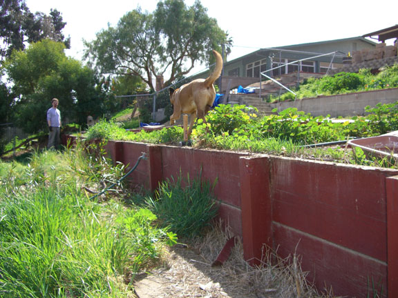
A cesspool of demon weeds called foxtails.
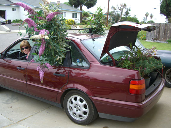
We cleaned the living hell out this yard. I did silly things like packing huge amounts of plants and my (other) sister into my car in successive trips to the local nursery.
In the process of working on our yard I developed a new appreciation for the color. I always thought plants had green leaves and the flower was the color excitement. Not the case. Leaves and greenery range in depth and hue from soft green of sage leaves to deep dark redish-green foliage of my nectarine tree.
Henri Matisse saw these subtleties long before I did, specifically choosing a different green for each leave in his painting, Goldfish.

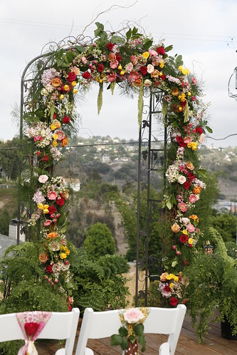
Green builds the perfect backdrop for the beauty of other colors including the remarkable colors of flowers. I have begun to look at green with new appreciation. Something I should have been doing all along. All that discovery and laborious work ultimately paid off because this was the setting for our wedding: